Sunday, August 4, 2013
Super

Fan art. This, of all topics, was the furthest one from my guess as to what my natal blog post would be about. To put this into perspective, the piece that I have just finished and am about to write a commentary on is the first serious stab at fan art that I have ever made outside of practice-sketches of famous people or a contest entry. Normally my aspirations call me to design concepts of characters from my imagination, perhaps as an aid to help visualize a story that I'm developing or one that's merely stirring somewhere in my consciousness. But one day I noticed that I have a fairly conspicuous absence of fan art in my life, and I asked myself why? After much introspective contemplation on the matter I found that I had a somewhat cynical attitude towards the genre. I felt that fan art was a waste of time and that there was a certain amount of pettiness to it's creation. I thought..."Real artists don't make fan art. Real artists make art that others make fan art of."
So, I was convinced that I should make some fan art. Deciding what to make fan art of was somewhat of a challenge--not because there isn't much that I am a fan of, but because I am a fan of so many things. One of the first ideas that came to mind was Batman, who is quite possibly my favorite comic book superhero. But I had a goal to experiment with bold color and deep texture with this piece, and Batman isn't the most colorful superhero by any stretch of the imagination. So I fed into my overwhelming excitement for this year's DC Comics blockbuster film Man of Steel (an amazing film, by the way) and decided to paint the title character, Superman, instead.
 |
| New Design |
Now, the aforementioned film portrays the title character with a very dark and subdued color scheme with a unique suit design that doesn't appear in any of his other media. This didn't at all fit my goal of bold color, so I decided to base my Superman on the New 52 design that was introduced across DC's comic books in 2011.
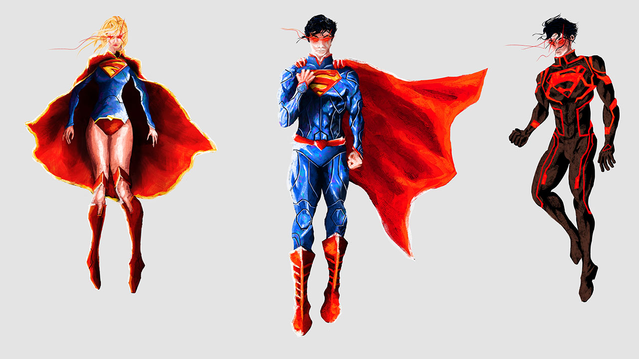
Although I initially had some strong reservations about the color imbalance caused by the exclusion of his red trunks and yellow belt from the traditional design that I was accustomed to growing up with...the trunks had to go. In their place is a single, angular red belt with the same "shield" shape as his chest symbol in the middle. What I really love about this design is the sophisticated armor-like indentations, the tall mandarin-style collar, the shorter and more lithe tri-pointed cape, the larger and slightly more stylized "S" symbol, the long pointed sleeves, the thick rubber boots, and the overall more lean and youthful build of our hero.
 |
| Old Design |
As of my new-found interest in the reading of comic books (something that I didn't have the opportunity of doing as a child due to monetary limitations), I had also come to discover two other Kryptonian superheroes that received even more interesting New 52 facelifts--Superboy and Supergirl.
 |
| New Design |
 |
| Old Design |
Superboy's new design is the most extreme of the three. From the strongly punk-90's influenced old design comprised of multiple belts and straps at various locations, a high-waisted black leather biker's jacket with tall black leather boots and thick red gloves to match, a side-shaved haircut and earrings to the decisively Tron influenced new design that's all black with glowing red techno computer circuit accents and chest symbol with a more modern and clean-cut hair style.
 |
| Old Design |
 |
| New Design |
I feel that Supergirl's redesign is a lot more practical than the old one. Call me old-fashioned, but I've never thought that a flying character should be adorned in a short skirt. So a one-piece leotard seems a far better choice in that respect. Additionally, the redesign maintains an excellent color balance with it's reds, blues, and yellows. The same angular and indented design language of Superman's redesign appears on that of Supergirl's with some unique variations, such as a sharply angular and stylized "S" symbol (the above image is a poor example of this), over-knee tall boots and the mandarin-style collar being integrated into the cape, which is elegantly pointed and adorned beautifully with yellow trim. The new suit design combined with an equally more practical (read manageable) modern hairstyle make for an excellent visual reboot of the Kryptonian heroine.
So where am I going with this? I decided to make a piece of fan art containing all three of these characters based on the New 52 design. I knew that it would be a pretty large undertaking considering how long it typically takes me to complete a Photoshop painting of just one character (7-15 hours) using techniques and styles that are familiar to me, but I couldn't do just one of them--they were all too unique and interesting to make such a decision. Thus began a long and initially frustrating process.
The original style that I began with was based on comic book-like lineart:
 |
| Left to right: Supergirl, Superman, and Superboy |
This frustrated me greatly. So much so that I shelved the project for weeks. Did I spend those weeks studiously improving my artistic skills? No. It was a hiatus...a hiatus and a half. Instead I spent the time taking care of other life problems such as moving, prepping for the impending college semester, and...loafing.
Was this productive? Not really. But did it help me get over my creative block? Yes. I leisurely immersed myself in [viewing] the art of others. And it inspired me. I found the bold colors of freelance artist Alice X. Zhang, the distinct style of concept artist Kekai Kotaki, and the thoughtful use of texture by both artists just the right inspirational medicine that my creative soul needed. So I picked up the 'ol Wacom tablet and dove back into Photoshop. After all was said and done, I made this:

A far cry from what it was looking like pre-hiatus:

It clearly just wasn't enough to stick to what I was comfortable with. Once I realized that was exactly the thing that was frustrating me I decided that I needed to do just what I set out to do with this painting: experiment. I needed to just go straight into color, and use a brush that wasn't perfectly round or uniform.

Instead of simply colorizing soft black & white values into a single hue, I used a variety of colors to give the impression of one. Blue is not simply...blue. It needed to be a combination of secondary and tertiary colors such as greens, blue-greens, pinks, purples, etc. Likewise, red couldn't simply be red. It must have oranges, red-oranges, yellows, pinks, etc.

Brush strokes were no longer permitted to be uniform and without texture. They needed to be dynamic, confident, and whimsical with deep texture that compliments the rich color palette. I had to constantly remind myself that this isn't an exercise--it's an experiment...an expedition into the unknown...a safari through the unfamiliar.
Full process:
 |
| Base line art. |
 |
| Filled in line art with black silhouettes. |
 |
| Duplicated and inverted line art to use as guidelines for coloring. |
 |
| Painting-in the "reds". |
 |
| Adding "blues". |
 |
| Adding skin tones with some size/placement corrections. |
 |
| Hair. |
 |
| Beginning on the background. |
 |
| Adding color to the background. |
 |
| Finished. |
While I won't say that all future paintings will follow the style and aesthetic of this piece, I am hoping to explore and refine it some more as well as attempt to create a convergence with other styles/techniques in future studies.
All in all this was an incredible learning process, as well as a very time-consuming one. Aside from the hiatus that I mentioned, and the fact the I drew three characters as opposed to my usual one, my ageing 2009 midrange laptop has not been the most optimal experience with a 51-layer Photoshop document with a canvas size of 15360 × 8640 at 300 ppi (the final file size was just over 1 GB).
My apologies for the length of this first post--I promise the next will be shorter. But this was a surprisingly complex subject, and it will undoubtedly be revisited sooner than later. Fan art has a way of bringing communities together and presents unique opportunities in interpretation, exploration, and conversation. So please leave a comment if you so desire--I'd love to hear from you!
Until next time,
"Up, up, and away!" - Superman
- Luke
Subscribe to:
Post Comments (Atom)
No comments:
Post a Comment